A branded payment portal is more than a checkout page—it’s the moment your brand either earns trust or loses a conversion. When customers pay through a portal that looks, feels, and communicates like you, they’re reassured that their money and data are safe. The result: higher completion rates, fewer disputes, and a smoother path to repeat business.
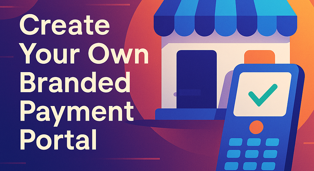
Table of Contents
What Is a Branded Payment Portal?
A branded payment portal is a secure, web-based checkout experience—hosted or embedded—that mirrors your brand identity across layout, copy, colors, and micro-interactions. It handles authentication, payment method selection, currency presentation, and confirmation while integrating with your CRM, ERP, accounting system, and anti-fraud tools.
With Philipay, you can pair a branded payment portal with capabilities such as International Payments, a Multi-Currency Account, and Currency Capabilities so customers see familiar local options and transparent pricing.
Why Brand Matters at Checkout: Trust, UX, and Revenue
Trust is fragile at the moment of payment. Users abandon if the page looks generic, slow, or “off brand.” Independent UX research shows that checkout quality directly correlates with completion rates, making this the highest-leverage surface in your conversion funnel. (See Baymard’s long-running checkout UX findings.) (Baymard Institute)
Payment preferences are shifting, too. Digital wallets are taking a larger share of transactions—especially on mobile—so portals that support wallets natively convert better than those that do not. (According to Worldpay’s Global Payments Report, wallets continue to grow globally.) (worldpay.com)
In the UK, for example, mainstream adoption of mobile wallets surged in 2023, reinforcing the need for wallet-ready checkouts. (As reported by the Financial Times, one-third of Britons used mobile contactless monthly, with wallet registrations rising sharply.) (Financial Times)
7 Proven UX Principles for Your Branded Payment Portal
1) Keep It Minimal, Predictable, and Mobile-Perfect
A branded payment portal should load fast, present a single, linear path, and make actions obvious. Avoid layout shifts, intrusive cross-sells, and anything that looks different from your site’s design system. If you redirect to a hosted page, preserve brand continuity with your logo, domain/subdomain, typography, and tone of voice.
- Mobile first: prioritize large tap targets, sticky “Pay” CTA, and auto-focus on the next field.
- Visual hierarchy: primary payment action stands out; secondary actions stay visible but quiet.
- Accessibility: semantic headings, labels, and proper contrast—trust is inclusive by design.
Stripe highlights how clarity, simplicity, and trust signals improve conversion—good guidance even when your processor is different. (Stripe)
2) Remove Friction in Forms
Every extra field risks abandonment. Streamline to essentials: amount, method, contact, and legally required data. Then optimize:
- Inline validation to catch errors early
- Autocomplete for address and card name fields
- Sensible defaults (e.g., country from IP, currency from product/region)
- Save details securely for faster future checkouts
Baymard’s research consistently finds form friction among top causes of drop-off; trimming fields and improving validation reduces abandonment. (Baymard Institute)
3) Offer Local Payment Methods & Currencies
Shoppers convert when they can pay locally and see the currency they expect. Your branded payment portal should:
- Detect the user’s region; show familiar rails (cards, bank transfers, local schemes, and wallets)
- Present prices and totals in the local currency with a clear FX rate and fees
- Support settlement to your Business Account and reconciliation in your base currency
Philipay’s International Payments and Multi-Currency Account help you accept and manage cross-border flows without confusing conversions for customers. Wallet-ready portals capture incremental conversions as wallets’ share rises globally. (worldpay.com)
4) Make Security Visible—Without Scaring Users
Security is a feature your customers feel. Show enough to reassure, not overwhelm:
- Display recognizable indicators (padlock in browser, HTTPS, recognizable domain)
- Use clear copy: “Your payment is encrypted and processed securely.”
- Implement strong customer authentication (e.g., 3-D Secure 2 where applicable)
- Offer helpful microcopy during step-ups: “We’re verifying your bank. This takes ~10 seconds.”
Trust research (e.g., Edelman) underscores how visible, responsible practices maintain confidence during critical moments like checkout. (Edelman, edelman.de)
5) Set Clear Expectations: Fees, Timing, and Support
Uncertainty kills trust. Your branded payment portal should:
- Break down totals (amount, taxes, fees), before the final click
- Share when funds leave and when you’ll deliver goods/services
- Provide live help options: chat, email, or callback
- Confirm with a clean receipt page and email, including support links
If you invoice clients or accept remote payments, Philipay’s Pay by Link routes customers to your branded page with the amount and references prefilled—cleaner, faster, and less error-prone.
6) Optimize for Wallets and Tokenized “One-Tap” Flows
Wallets (Apple Pay/Google Pay) and card tokenization allow one-tap or few-tap payment, especially on mobile and returning sessions. This is where a branded payment portal shines:
- Tokenize credentials for returning users (with clear consent)
- Prioritize passkeys/biometrics for auth where supported
- Surface the best method for the current device automatically
Industry guides show that wallet-ready, simplified checkouts consistently outperform clunky flows—especially on mobile. (Stripe)
7) Measure, Test, and Personalize
Great portals are never finished. Instrument each step—method selection, authentication, error states, and success—so you can A/B test copy, field order, and wallet prominence. Pass clean metadata to your analytics/CDP and accounting.
- Track drop-off by device, method, and geography
- Monitor approval/decline rates and reasons (insufficient funds, SCA, AVS/CVV mismatch)
- Personalize method ordering by past behavior and location
For teams using Stripe in parallel, their funnel analytics docs offer practical instrumentation patterns you can generalize to any stack. (Stripe Docs)
Security & Compliance: Building Trust into the Portal
A branded payment portal earns trust when it bakes in good governance:
- PCI DSS alignment: minimize scope by using tokenization and hosted fields where possible
- Data minimization: collect only what you need; vault sensitive data with your PSP
- SCA/3-D Secure 2: comply with regional rules while keeping UX smooth
- Fraud controls: velocity checks, device fingerprinting, risk scoring, and adaptive step-ups
- Auditability: detailed logs, immutable receipts, and reconciliation that ties to your ledger
Philipay complements this with operational controls such as Mass Payments for disbursements and Domestic Transfer for local rails, simplifying both compliance and reporting.
Branded Payment Portal Architecture: Build vs. Buy
Option A – Fully Custom:
You design UI, host the portal, and integrate directly with gateways/acquirers. Pros: total control; cons: higher PCI scope, ongoing maintenance, and a longer path to parity (wallets, new schemes, risk tools).
Option B – White-Label / Hosted Payment Page (HPP):
You configure branding, methods, and flows; the provider handles sensitive parts and compliance. Pros: lower PCI scope, faster rollout, instant access to methods and wallets; cons: fewer exotic customizations.
Option C – Hybrid:
Embed hosted UI components (fields, methods) in your app; keep your brand shell and orchestration, offload sensitive steps to the provider.
Philipay supports hosted and hybrid approaches, so your branded payment portal looks and feels native while benefiting from secure processing and rapid method enablement. If you operate across currencies, pair the portal with a Multi-Currency Account to reduce FX friction at checkout.
How to Launch a Branded Payment Portal with Philipay
Below is a practical, vendor-agnostic plan—with Philipay specifics noted where helpful.
Step 1: Define Success Metrics and Constraints
- Conversion lift target (e.g., +3–7% within 90 days)
- Approval rate baseline and target (e.g., raise from 88% to 92%)
- SCA/3DS step-up rate and completion
- PCI scope level you’re willing to own
- Supported regions, currencies, and payment methods
Step 2: Design Your Brand System for Checkout
- Extend your design tokens (colors, typography, spacing) to the portal
- Create microcopy standards: concise labels, tone guidelines for errors and help text
- Prepare assets: logo variants for light/dark mode, favicon, email headers
New to Philipay? Learn about our secure infrastructure and team on the About Us page.
Step 3: Choose Integration Model
- Hosted payment page (fastest): Ideal if you want a branded payment portal with minimal PCI scope.
- Hybrid UI components: For deeper embedding while staying out of PCI scope.
- Direct API + vault: For edge-case control (more engineering + audits).
Philipay supports all three, plus Pay by Link to create branded, one-off or recurring links that land in your portal.
Step 4: Configure Methods, Currencies, and Routing
- Enable cards, bank transfers, and digital wallets first; then layer in local rails per market.
- Set currency display logic (auto by geo, product, or user preference).
- Use smart routing for authorization uplift (bin-based routing, retries).
Pair with Philipay’s Currency Capabilities and International Payments so customers always see familiar options.
Step 5: Implement Security & Risk Controls
- Tokenize payment details; never store raw PANs.
- Turn on 3-D Secure 2 where mandated or high-risk; keep friction adaptive.
- Configure risk rules (velocity, IP mismatch, high-risk bins) and case management.
Step 6: Connect Back-Office Systems
- Sync customers, invoices, and receipts to your ERP/accounting (Xero, NetSuite, QuickBooks, etc.).
- Automate reconciliation flows using webhooks and references.
- If you run large payout operations (e.g., marketplaces or BPOs), use Mass Payments to disburse at scale.
Step 7: QA and Launch with Guardrails
- Test success/failure paths, SCA challenges, refunds, and chargebacks.
- Verify email/SMS receipts and support links.
- Start with a canary rollout (e.g., 10% of traffic), then expand.
Want hands-on guidance? Contact our team for a tailored rollout plan.
Metrics That Matter: How to Prove ROI
1) Conversion Rate (by device & geo).
Lift here translates directly to revenue. Align with Baymard’s advice: fewer fields, clearer steps, and stronger validation. (Baymard Institute)
2) Authorization Rate.
Track approvals/declines by issuer and method; adjust routing and SCA logic accordingly.
3) Wallet Adoption.
Watch share of Apple Pay/Google Pay; growth here is a leading indicator of reduced friction, mirroring broader market trends. (worldpay.com, Financial Times)
4) Time-to-Pay & Error Rates.
Measure average seconds to complete payment and the frequency of CVV/AVS errors.
5) Chargeback Ratio & Dispute Win Rate.
A well-designed branded payment portal reduces “merchant doesn’t look legitimate” chargebacks by making identity, receipts, and support obvious.
6) Support Contact Rate Post-Payment.
Falling contact rates signal that your portal sets better expectations.
Common Mistakes to Avoid
- Brand Whiplash.
Routing users to an off-brand HPP without your domain, logo, or typography raises red flags. - Clutter and Distractions.
Upsells in checkout, excessive banners, or confusing options dilute focus. - Hiding Fees or FX.
Surprise costs at the final step are a top abandonment trigger—be explicit early. - Neglecting Wallets and Local Methods.
If the methods are wrong for the market, users bounce. Keep up with trends and enable what customers expect. (Global data shows wallet growth outpacing cards in many markets.) (worldpay.com) - Skipping Analytics.
If you don’t measure drop-off by step, you’re guessing. Instrument and iterate. (Stripe Docs)
FAQs
Is a branded payment portal only for eCommerce?
No. It’s for any scenario where you collect money online: B2B invoices, subscriptions, donations, deposits, and services. Philipay’s Pay by Link lets you send branded links via email, chat, or invoice systems that land customers directly in your portal.
Do I need a multi-currency setup?
If you accept international customers or operate cross-border, yes—prices should display in the buyer’s currency. Philipay’s Multi-Currency Account and International Payments keep rates transparent and settlement tidy.
What about payouts?
If you need to pay suppliers, creators, or a distributed workforce, combine your branded payment portal with Mass Payments for reliable, trackable disbursements.
Is compliance hard?
Compliance is simpler when sensitive data never touches your servers. Use hosted fields, tokenization, and adaptive SCA to lower PCI scope while maintaining a seamless branded experience.
Next Steps
- Learn who we are and how we secure your growth on our About Us page.
- Have complex requirements or a multi-region rollout? Talk to our team for an expert architecture review.
- Ready to go live? Register for a Philipay account to start building your branded payment portal today.
Why Philipay?
Because exceptional service, robust security, and real-world payments expertise drive everything we build. With Philipay, your branded payment portal doesn’t just look right—it performs right. To start streamlining your international transactions, register for a Philipay account today and experience the difference.